Together Forward Travel
Role: UX Researcher and Designer
Client: CareerFoundry UX Design (Academic)
Timeline: 4 Months
Tools: Figma, Miro, Balsamiq, Procreate, UsabilityHub, OptimalSort, Google Forms, Google Sheets
Together Forward Travel showcases my ability to conduct user interviews, usability testing, and the decision-making skills to pivot when necessary. I worked on this project from conception to delivery.
YouTubeWatch a video of the prototype
Define
I was tasked with designing an app that provides custom itineraries. I formulated a list of possible problems the app could solve for our travelers and how it could be helpful.
I hypothesized that travelers:
- Dollar SignFind a travel agent expensive
- CalendarDon’t want to adhere to a tour schedule for the whole trip
- Puzzle PieceHave unique interests that aren’t catered to
- PencilDon’t feel confident in their ability to research and plan
- SlidersDesire customization
I crafted my initial problem statement.
Our traveler needs a way to connect to a local travel agent or guide that can offer them customized itineraries because the current market offerings are too structured or expensive.
We will know this to be true when we see trips successfully planned and increased engagement on the app.
Research
I conducted competitor research on two companies that provide travel customization services, Journy and Mr. Hudson. This included company structure, funding, strategies, market advantage, social media presence, and areas for opportunity.
I created user stories focused on key functionalities I currently thought would be helpful for travelers. These would establish some preliminary app expectations to keep in mind until confirmed through user research.
I established research goals and surveyed 35 participants using Google Forms. Participants were recruited through social media and had traveled recently or planning future travel. The survey was a quick and effective way to obtain simple data on people's travel processes and frequency.
Key insights from the survey included:
With this information, I conducted three in-person user interviews with participants in the app's age demographic interested in travel and mobile app friendly.
Takeaways from the user interviews:
Activity-Focused
Participants were active and activity-focused on their previous travels or future interests.
Willing to Use Travel Planners
Unlike the survey participants, they had considered or used travel planners.
Limited Travel App Knowledge
Participants were unaware of existing apps that offered requested functionalities.
I hypothesized that survey participants are traveling to familiar locations like visiting family or prefer more downtime during their vacations. I catered the app toward an activity-focused traveler based on my user interviews.
With my interview notes and audio, I created an affinity map. I evaluated the affinity map and made mental notes for things I would improve on next time to make it digestible at a glance.
The affinity map provided further insight into our travelers and how the app can cater to them.
- SlidersDesire the option to customize
- StarUse reviews to help make choices
- HouseAirbnbs are their lodging preference
- TrainArranging transportation is stressful
- GemWilling to purchase all-inclusive packages
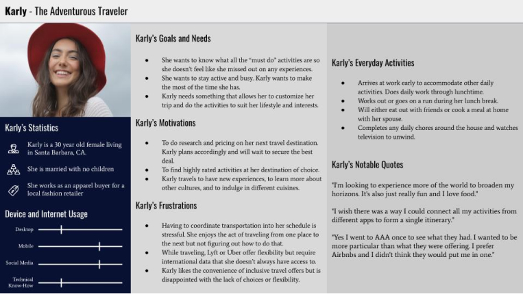
After completing my research analysis, it was time to craft two user personas and user journeys.
Meet our primary persona, Karly, the adventurous traveler. She is a savvy, experienced traveler interested in customization for her entire upcoming trip to the Azores with her spouse. Karly wants to experience new activities and must-see locations while getting the best price. She is patient and will wait to secure a deal.
I completed a content audit for Mr. Hudson, focusing on their trip design product. The audit helped me understand how a similar platform was structuring its content, and I enjoyed the organizational aspect of the task.
I established initial user flows and a site map to visualize necessary functionalities. Before proceeding with these, I performed a card sort using OptimalSort with nine users with my menu naming conventions. I wanted to test how intuitive the navigation was. The sorting was a quick, inexpensive way to simplify my names and structure.
Wireframes
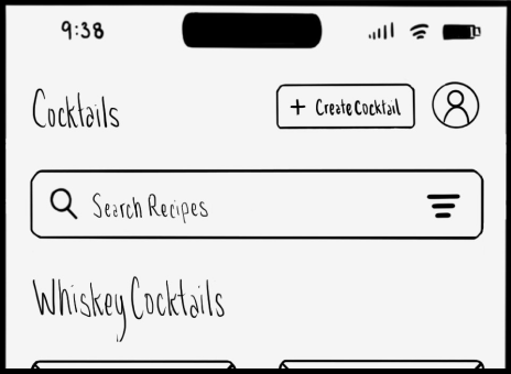
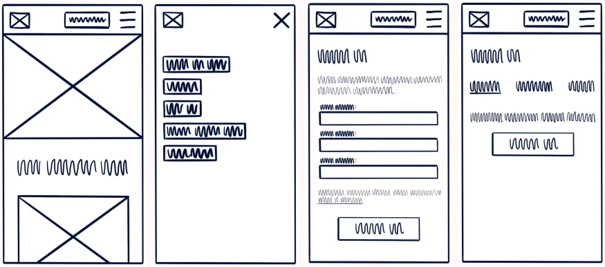
With my research in hand, I began with some low-fidelity wireframes. I also created wireframes for large device types to visualize how the elements would scale if necessary.
I evaluated the low-fidelity wireframes and decided to exchange the panel navigation for bottom navigation. The panel navigation was not convenient and hid items behind a menu. I wanted to pad the menu with unnecessary links to fill it out, which was counterproductive to a good experience. Changing the navigation and user flow required additional development time, but addressing the issue in earlier design stages would ideally provide a better experience later.
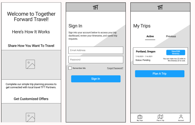
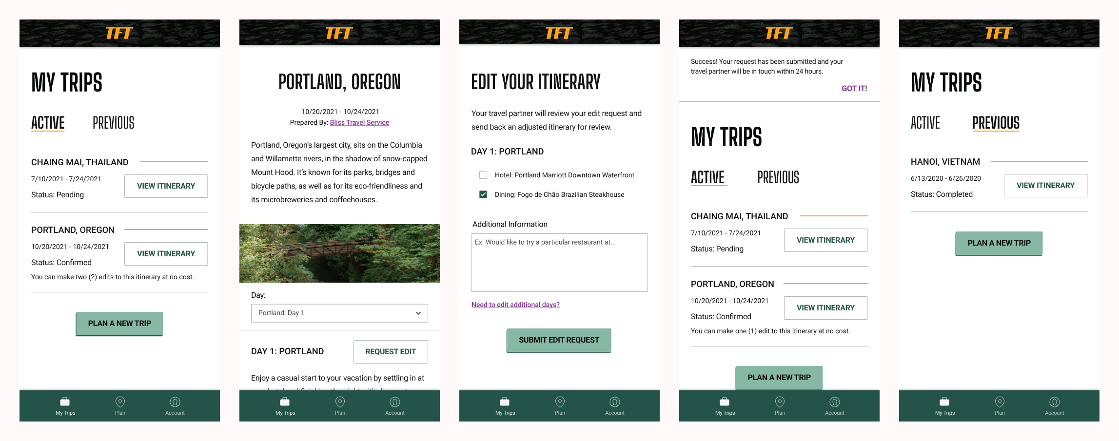
With these changes, I completed mid-fidelity wireframes in Figma for the sign-in pages, trip planning process, and the “My Trips” pages. I used these wireframes to develop a prototype for usability tests.

User Testing
It was time to perform usability tests to observe how participants navigated the app and how they added trip requests. The usability tests would confirm or deny if the structure and navigational updates were a move in the right direction.
I prepared a test plan, script, and consent form for six (6) moderated in-person usability tests. I recruited participants from my professional network and social media who were within the age demographic, used mobile apps, and had traveled recently or were planning a trip.
Audio, video, and notes from testing were compiled and synthesized into an affinity map. I organized and grouped the map better than in my previous ones, which helped me understand the data easier moving forward.
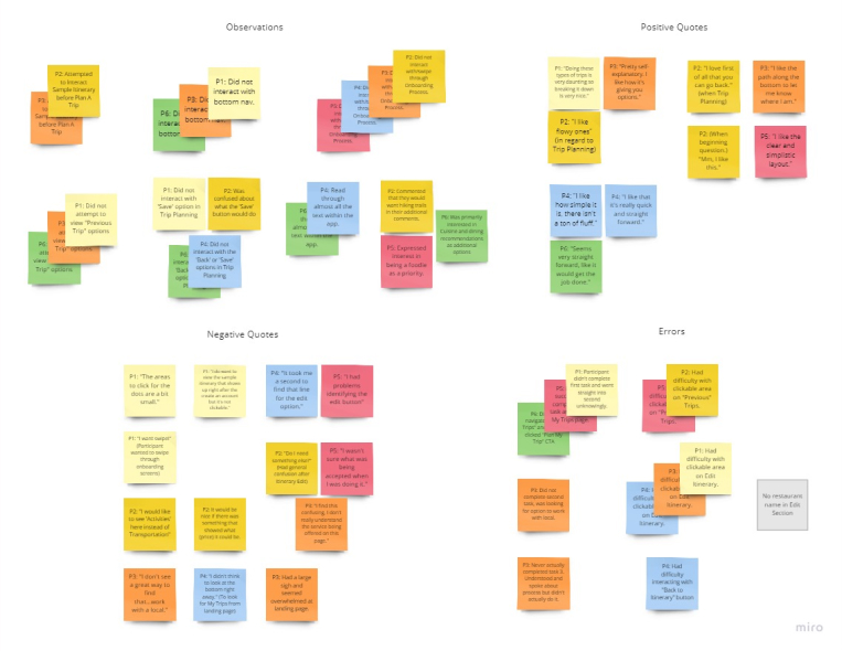
I organized the affinity map data into a rainbow spreadsheet, which allowed me to see error severity and frequency at a glance while noting possible solutions.
Pain points included the onboarding process, buttons, and a potentially unnecessary "save" function.
Iterate
I worked through my rainbow spreadsheet, making updates as prioritized by severity, frequency, and an approximate timeline.
A high-severity issue included how participants didn’t swipe through the onboarding carousel, which led to confusion later as to what the service was offering.
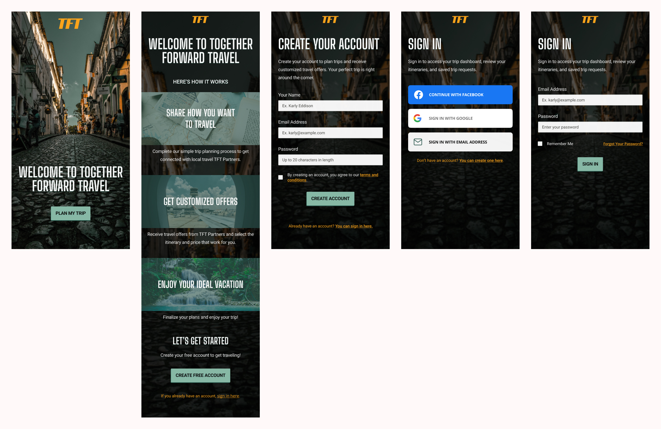
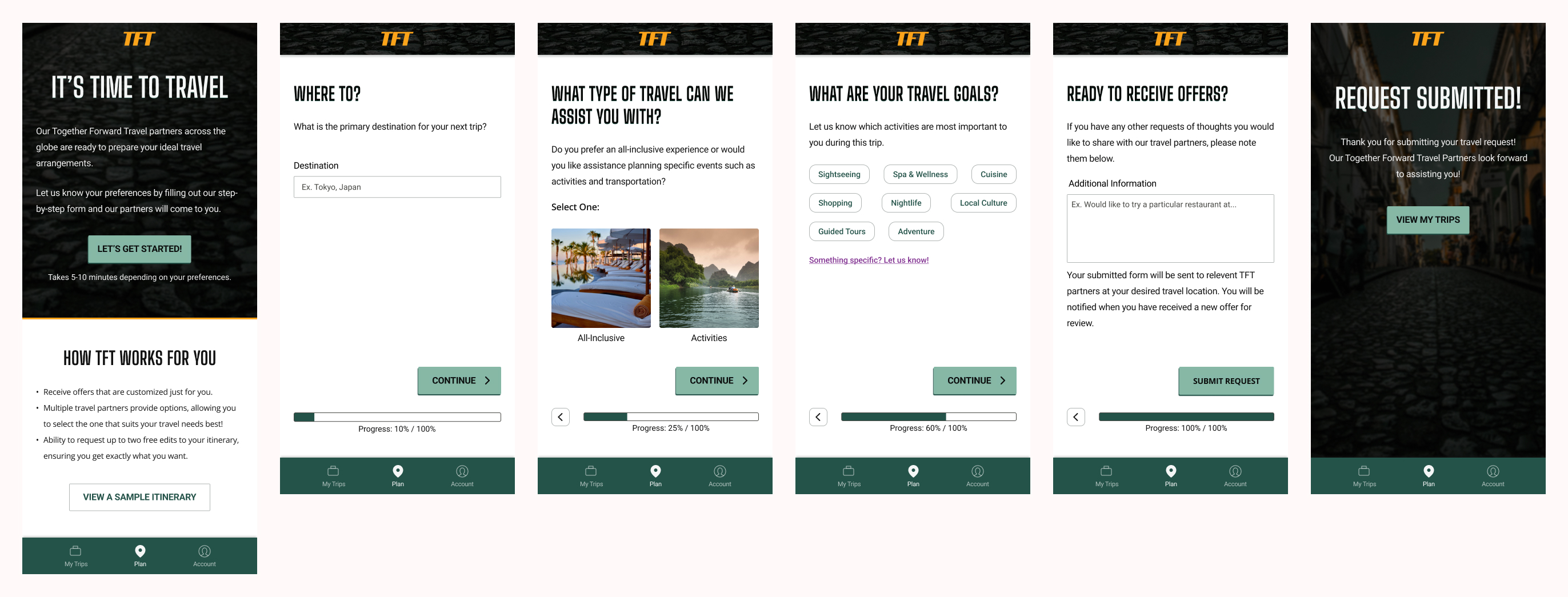
I adjusted the onboarding to a vertical scroll layout and removed unnecessary wording.
I also performed a preference test with 25 participants to determine if the word “free” on the button would incentivize continuation.
16 out of 25 participants preferred the “free” button wording, and I updated the button to reflect this.
Design
While determining the color palette, I considered our adventurous traveler Karly. Together Forward Travel includes natural greens, a high-energy yellow-orange, and an exotic purple to evoke feelings of joy and new experiences.

I utilized and applied Material Design guidelines and designed along an 8pt grid. Due to my familiarity with Bootstrap's framework, I designed with that in mind for certain components.
After evaluating the elements in use, I established design documentation and a design language system.
I audited the design against WCAG standards for ADA compliance and made adjustments to ensure a compliant and consistent user experience.
Below are the final mocks for Together Foward Travel.
Reflect
Working on Together Foward Travel helped solidify my understanding of the design process from start to finish. It improved my speed and comfortability with Figma. I have a better idea of how to approach and organize my next large project.
Next time, I will formulate some of my survey questions differently. I want to ensure I am asking questions that are simple to understand while providing good data.
I also want to make sure I am returning to my research, such as my personas, regularly throughout the design process.
I am currently working on my UX writing skills and can already see areas for improvement.
