Bar Tonic
Role: UX Researcher and Designer
Client: Alex Guizar, Software Developer
Timeline: Current
Tools: Miro, Figma, Procreate
The client is an avid home bartender and was unsatisfied with the current apps on the market. Deciding to create an app, he enlisted help designing Bar Tonic (working name). The goal is to develop a customizable, category-based cocktail app for home use that scales for medium-sized devices.
FigmaView the current prototype in Figma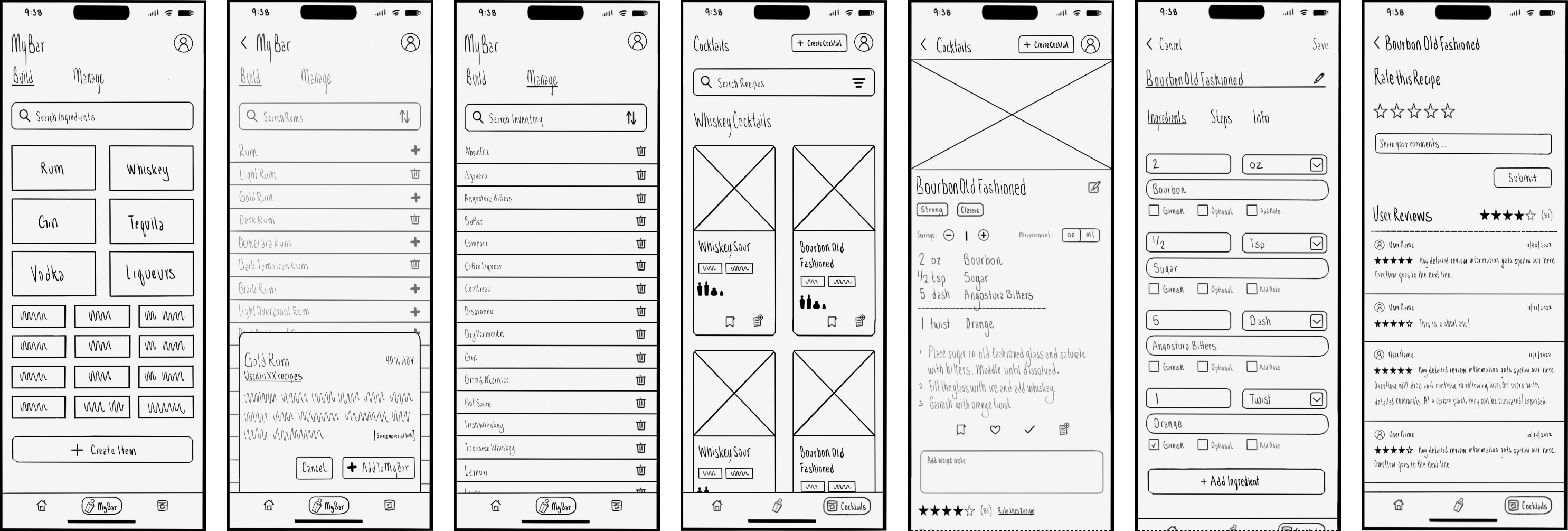
Define
I met with the client to better understand his design needs, required launch features, and what he felt was lacking from other apps. I moved forward with him as my persona and assumed he was the primary user demographic since the app was for his home use. Since the goal is to launch the app on the Apple Store, I intend to conduct usability testing later in the design process.
We agreed that categories and filters should be generalized or set aside until a database of cocktails is available.
Research
I started by completing a competitive analysis of the five most popular cocktail/bar apps available by rating and the number of downloads on both the Apple App Store and Google Play. The goal of the competitive analysis was to understand the client’s opinion towards the existing apps on the market, see what features were consistent and expected, and potentially find any areas of opportunity. All my findings were put into a document for the client to view if they were interested, which you can view here. I also took screenshots of key features from each app for quick reference if necessary.
The competitive analysis helped me construct a project overview that detailed an MVP for launch, with additional stretch goals if time allowed. The MVP included all the features I felt were required and reasonable and would add value to the app considering the current marketplace. Having this defined and approved by the client ensured we were both on the same page moving forward.
I organized the required features and wrote user stories for each, listing the necessary tasks. Doing this provided more context and gave me a better understanding of task association. I selected three user tasks I thought contained high-priority features and created task flows for them.
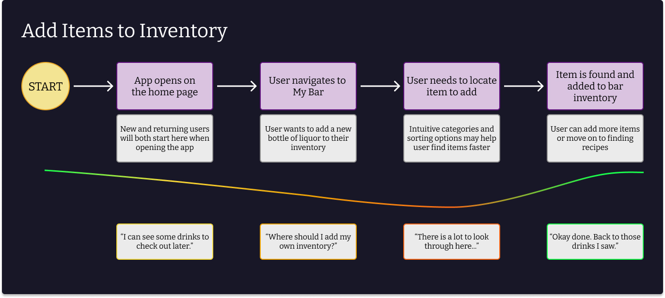
I used this step to help me visualize how the client would perform the task and tried to anticipate any areas of friction. Later in the design process, I referred to these task flows and evaluated my designs. Did the assumed pain point exist? Is there more I can do to make this task easier or enjoyable? I feel this helped me positively iterate on the designs.
I used Miro to create user flows for the user tasks, which helped me visualize the app structure and ensure I wasn’t overlooking any necessary features. Creating user flows allows me to consider items that might get overlooked, such as validation or storing data. You can view the full boards on Miro here.
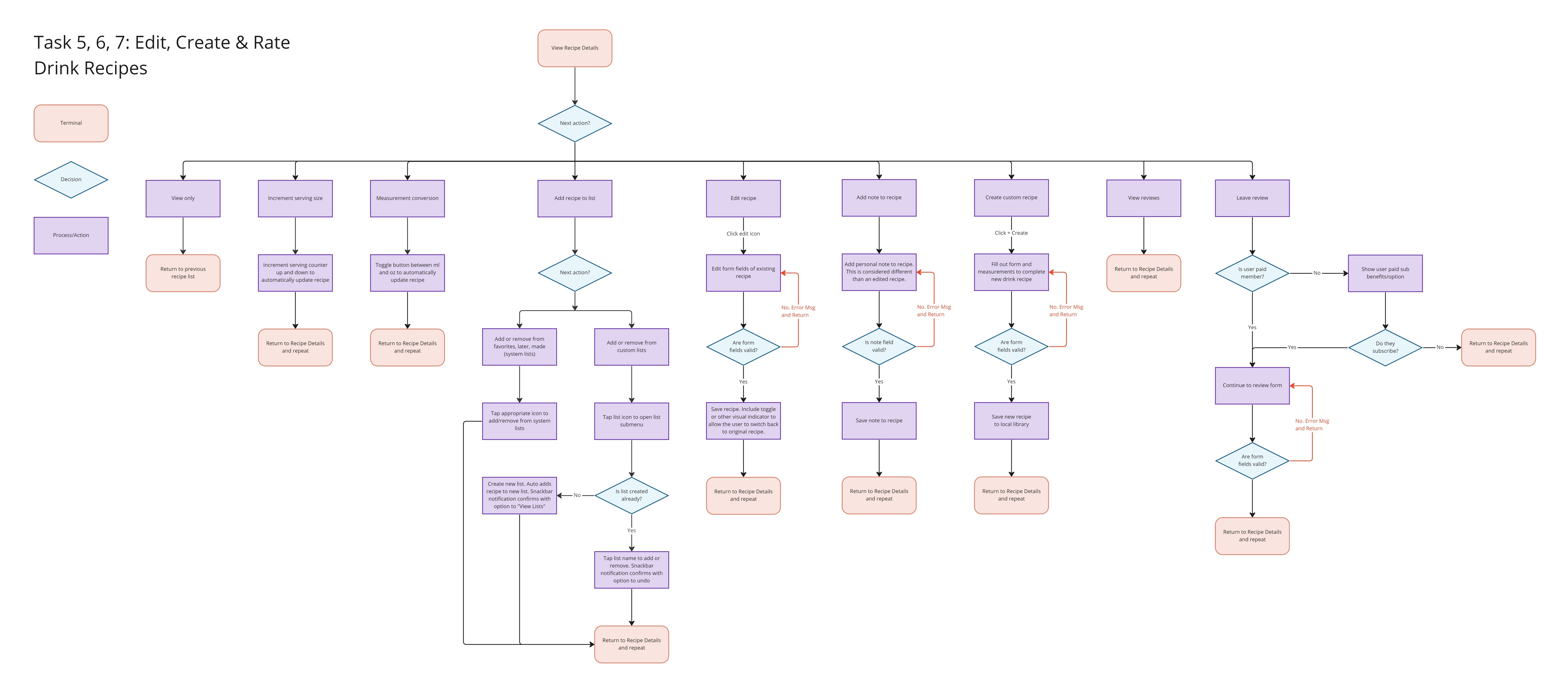
With these resources in hand, it was time to start working on wireframes to present to the client.
Wireframes
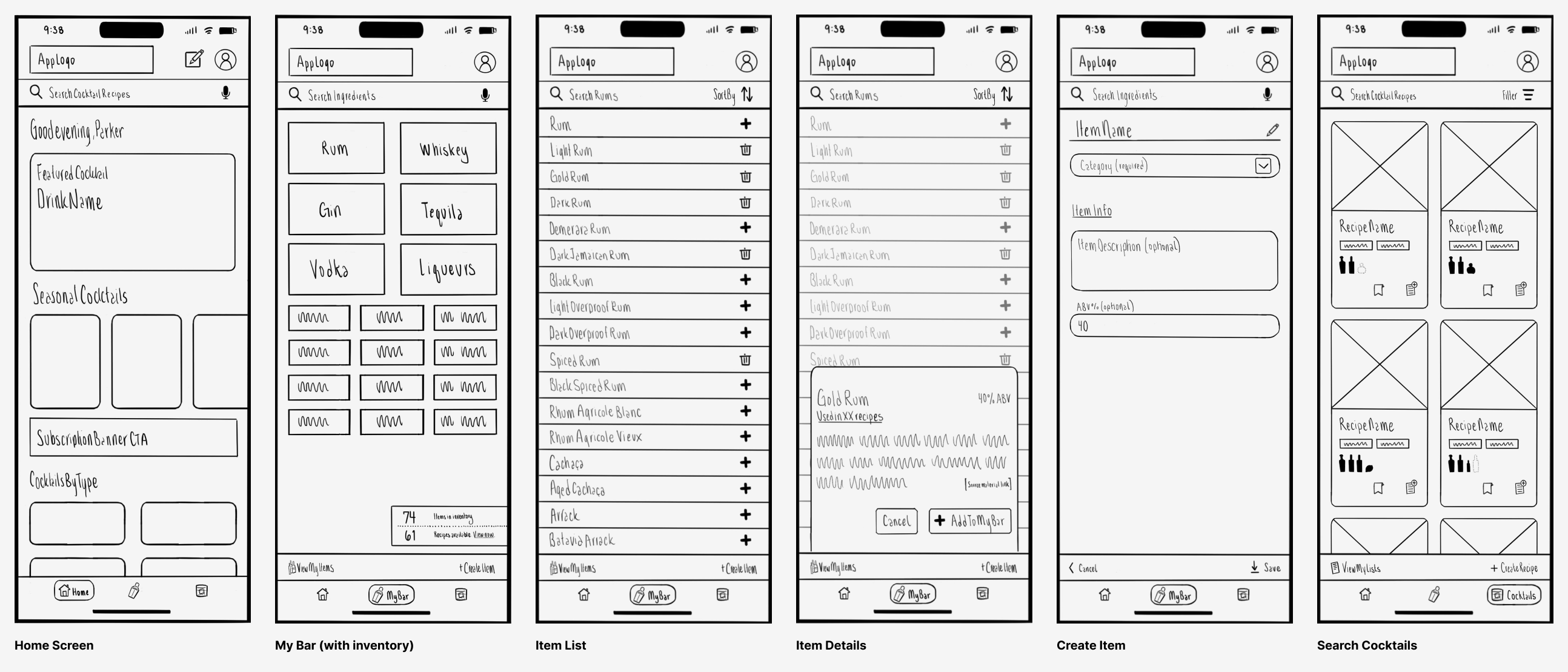
I created a first round of low-fidelity wireframes for the cocktail app. I presented these to the client and completed a round of updates based on the feedback and for consistency. I created a simple prototype from the updates so the client and I could navigate and evaluate the current state.
You can view the first prototype in Figma here.
Iterate
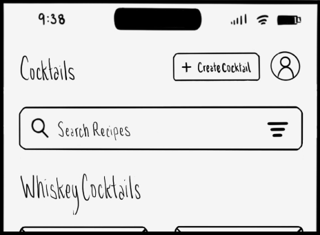
At first, the idea was to build the search bar into the header to allow the user to find recipes or ingredients from within the page. However, the consistency of the search bar in the header section almost had a “disappearing” effect, which was easy to overlook. Additionally, having it present at all times could be unnecessary, for example, when someone was editing a recipe. Providing the user what they needed to perform their desired task seemed a better option, so we agreed to have the search bar present in-page if applicable.
I observed competitors stacking functionality on the bottom navigation, and I mimicked this in my first designs. When using the prototype, it felt cluttered and inconsistent having those options change. I also had concerns that the cancel and save functions were in non-common places that I couldn’t justify. Removing the second bottom bar forced me to organize and clean up the navigational structure, which resulted in a cleaner, more familiar layout.
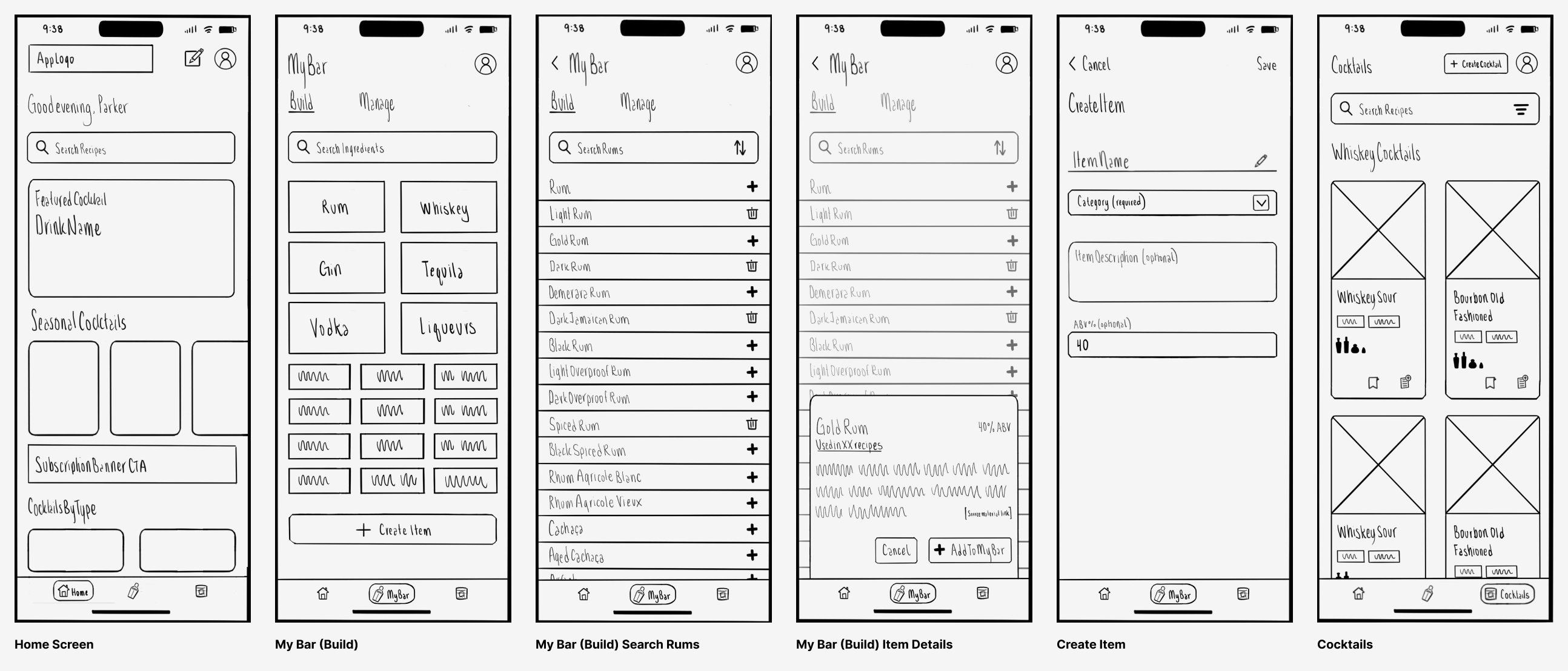
I made a second prototype with the updated low-fidelity wireframes, and the client approved this version.
Future Steps
I am in the process of scaling up the wireframes and designing for medium-sized devices. I am excited to create a unique experience for tablets, and I want to take advantage of the larger screen size and features. Additionally, I plan on conducting usability testing with the wireframes before progressing with the design stage.
More to come soon!
