¡Aprende!
Role: UX Researcher and Designer
Client: CareerFoundry UX Design (Academic)
Timeline: 3 Weeks
Tools: Marvel, LucidChart, Pen and Paper
¡Aprende! provided a research opportunity to better understand how students studied vocabulary and if they had any challenges with continued language learning in the past. This project demonstrates my ability to provide user flows, simple yet effective wireframes, and rapid prototypes. Forming consistent study habits can be difficult, and learning more about students’ needs was an engaging experience.
MarvelView the prototype in Marvel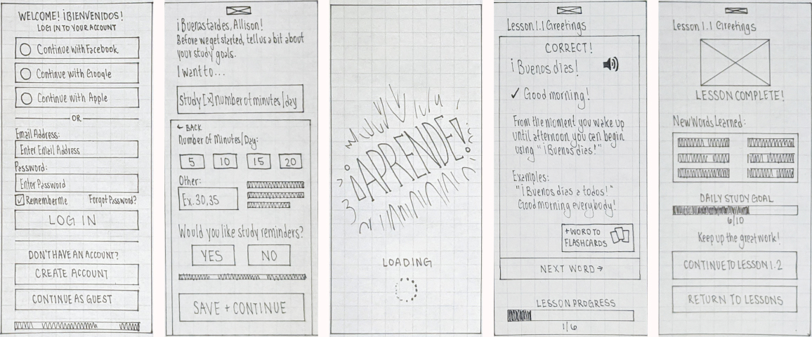
Research
Wanting to learn more about the existing market offerings, I completed a competitive analysis on three existing study apps. The goal was to understand what features they offered and areas for opportunity.
I then conducted three user interviews to gain insight into their previous experiences with vocabulary apps.
With this information, I formed a proto-persona, Allison. Allison is learning Spanish in her free time after work and needs to make her study time count. She needs to see progress to stay motivated.
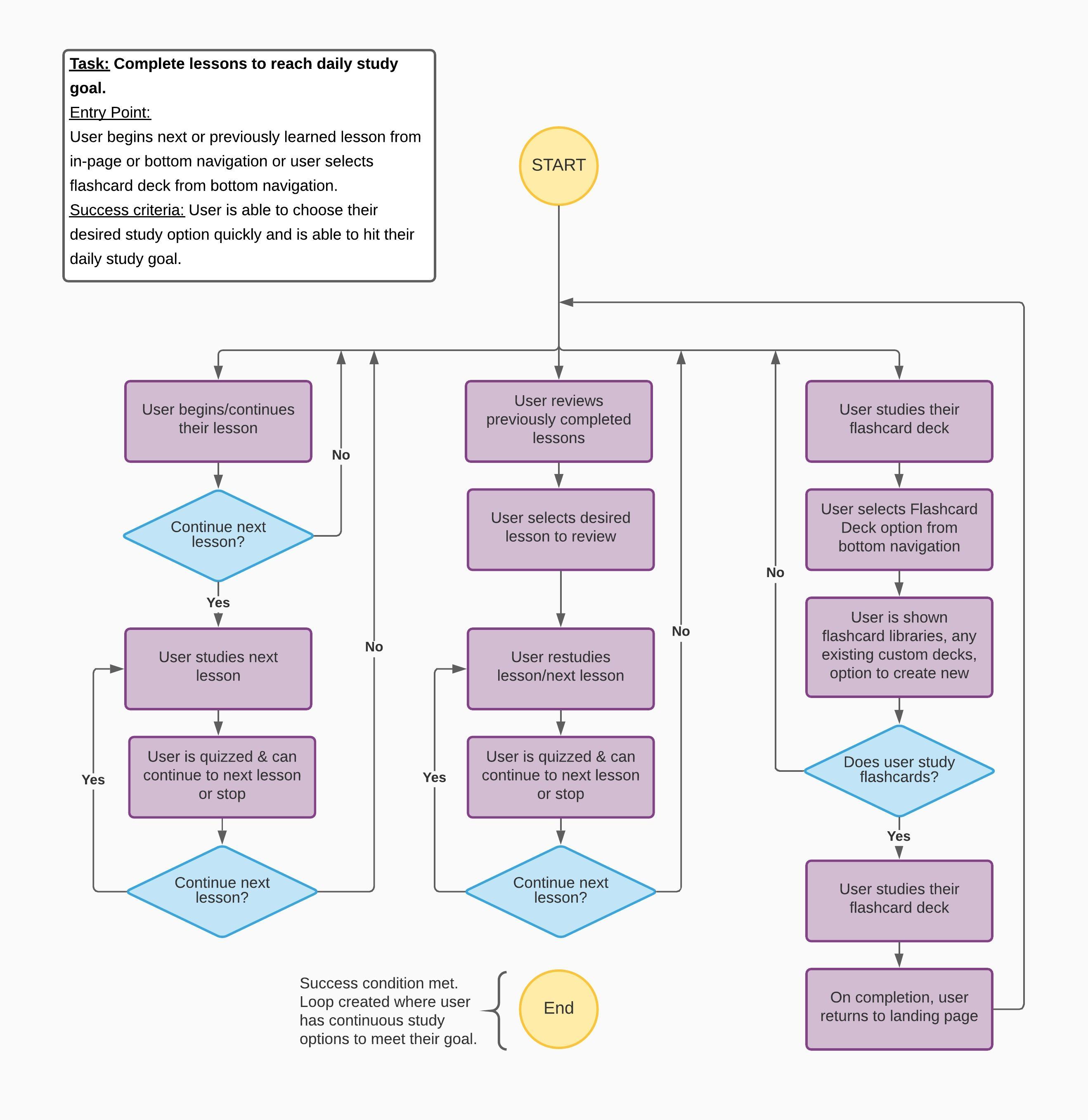
Allison’s primary task is to complete lessons to reach her daily study goal. I created the following user flow for this task considering the success criteria. I also included other functionalities, such as studying from a flashcard deck. I wanted to provide a complete picture of how a user might complete a study session.
User Testing
I sketched low-fidelity wireframes and created a prototype in Marvel for usability testing. The goal was to perform usability tests early in the design process to evaluate the onboarding and lesson flows.
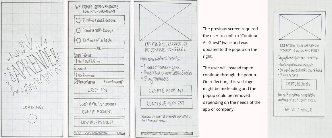
I observed two areas for improvement during testing. The onboarding process contained duplicate content and forced users to confirm their sections twice.
I switched out the account reminder screen for an occasional popup. On reflection, the wording "Tap to Continue" could lead to confusion, and I could remove the popup depending on the needs of the app or company.
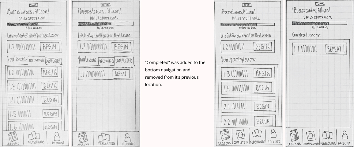
Secondly, I observed participants looking for completed lessons in the bottom navigation. Once they didn't find it there, they started searching within the content. I adjusted the navigation to include completed lessons to facilitate ease of use.
Reflect
This project reinforced the importance of performing user interviews and usability testing at the right time. I found myself tunneling into small details while creating the paper wireframes and have moved to a digital format in Procreate.
Moving forward, I would design mid-fidelity wireframes and prototypes. I would be interested in conducting a round of usability tests focused on the flashcards to see if it meets user needs.
